Quarterly trends in Fedora account creation and return cohorts.
Author
Robert Wright (rwright@)
Published
October 12, 2025
FAS Account Cohort Analysis
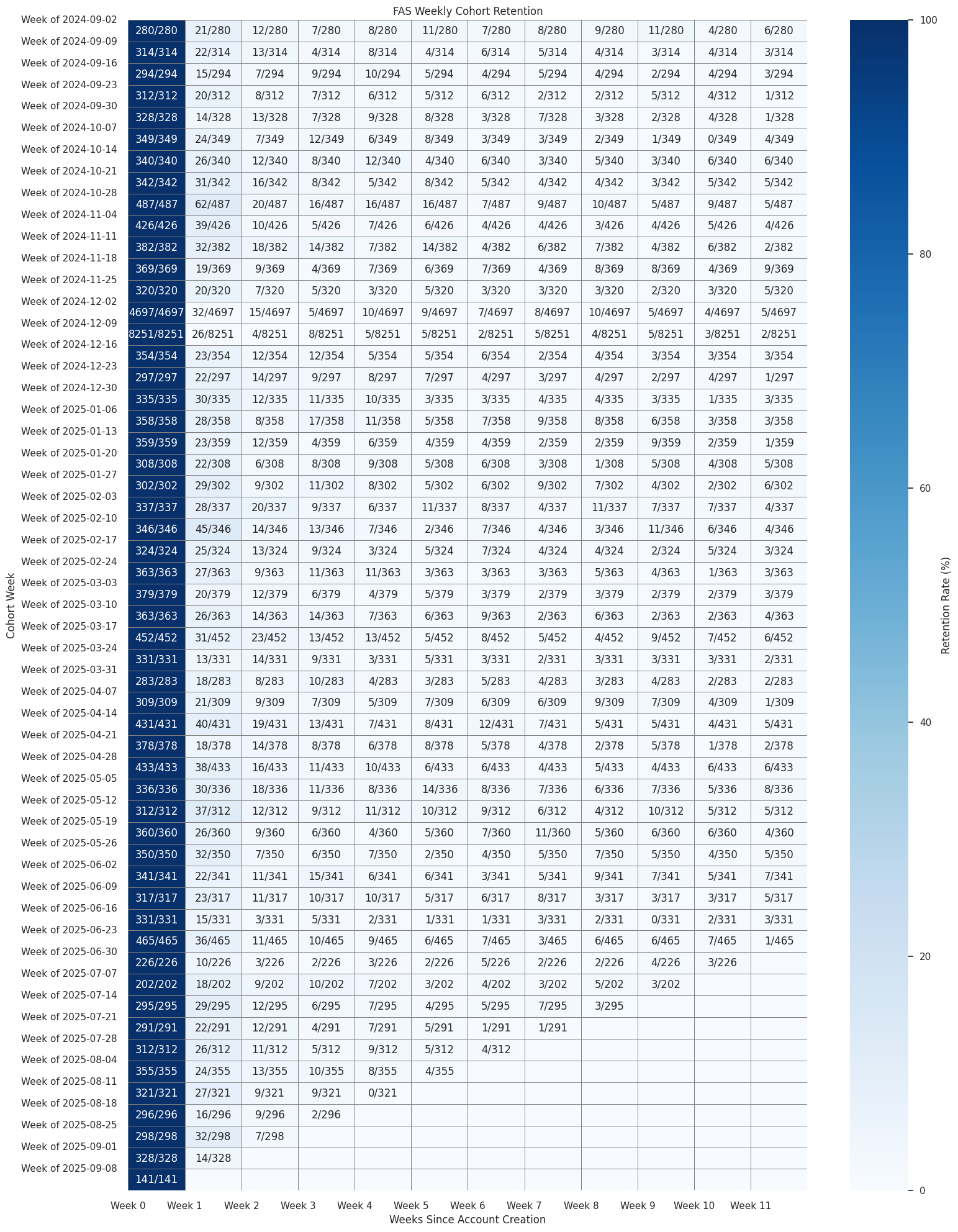
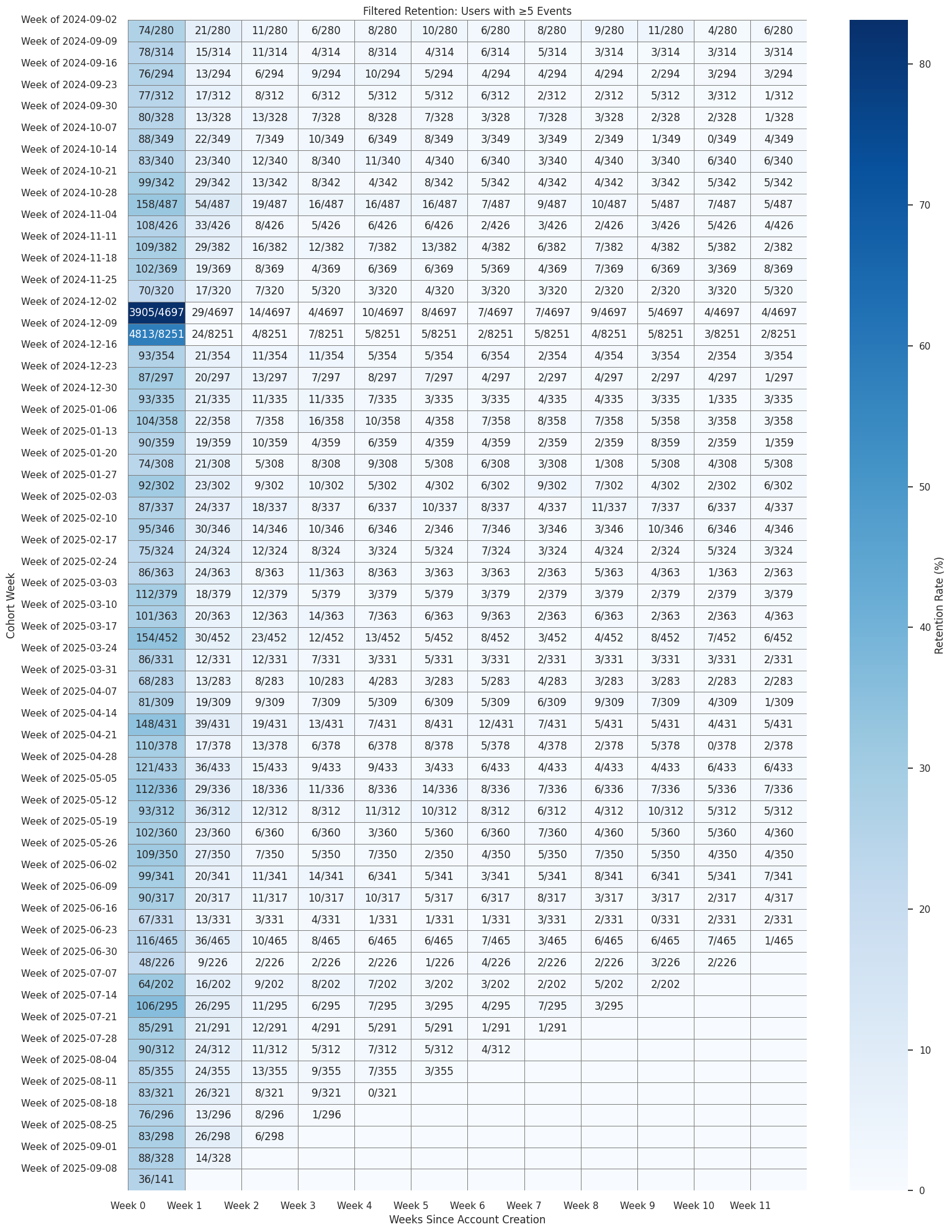
This notebook tracks community re‑engagement over time by analyzing Fedora account creation and return activity using weekly cohorts and visualizing user retention rates.
We define a Cohort of FAS accounts based on the week they enrolled into FAS and group their activity going forward.
Show the code
import osimport globfrom pathlib import Pathfrom datetime import datetime, timedeltafrom collections import defaultdictimport numpy as npimport pandas as pdimport matplotlib.pyplot as pltimport seaborn as snsimport pyarrow as paimport pyarrow.dataset as dsimport pyarrow.parquet as pqplt.style.use("seaborn-v0_8")sns.set_theme(context="notebook", style="whitegrid")
Show the code
# @replace DATA_SOURCESDATA_SOURCES = {"datagrepper-parse-accounts": "/home/jovyan/work/bus2parquet/output_users"}parquet_dir = DATA_SOURCES["datagrepper-parse-accounts"]cutoff_date = (pd.Timestamp.now().replace(day=1) - pd.DateOffset(weeks=52)).date()files = []for p in Path(parquet_dir).glob("fedora-*.parquet"): stem = p.stem.replace("_processed", "") d = datetime.strptime(stem.split("-")[1], "%Y%m%d").date()if d >= cutoff_date: files.append(str(p))dataset = ds.dataset(files, format="parquet")chunks = []for batch in dataset.to_batches(batch_size=50_000): df = batch.to_pandas()if"sent_at"notin df.columns or"username"notin df.columns:continue df["sent_at"] = pd.to_datetime(df["sent_at"], errors="coerce").dt.floor("s") chunks.append(df)combined_df = pd.concat(chunks, ignore_index=True) if chunks else pd.DataFrame()ifnot combined_df.empty:print("Maximum date in data:", combined_df["sent_at"].max().date())print("Minimum date in data:", combined_df["sent_at"].min().date())else:print("No data found in cutoff range")
Maximum date in data: 2025-09-10
Minimum date in data: 2024-09-02
max_date = combined_df['sent_at'].max().date()annotated = retention_counts.astype(object).copy()for i, cohort inenumerate(annotated.index): cohort_start = pd.to_datetime(cohort_sizes.index[i], format='Week of %m/%d').date()for week in annotated.columns: week_date = cohort_start + timedelta(weeks=int(week))if week_date > max_date: annotated.loc[cohort, week] =" "else: returned = retention_counts.loc[cohort, week] total = cohort_sizes[cohort] annotated.loc[cohort, week] =f"{int(returned)}/{int(total)}"retention_rate = retention_rate.iloc[:, :12]annotated = annotated.iloc[:, :12]label_map = new_users_df.drop_duplicates('cohort_week').set_index('cohort_week')['cohort_label']
The table below shows a weekly count of FAS accounts created each week. The table shows a number in “Number of Returned Users” / “Total Accounts Created in that Week” and then a weekly X axis to show weeks looking forward. If the account that was created in that week returns in what is that user’s Week 2, the count will increase.
Show the code
plt.figure(figsize=(16, 20))sns.heatmap( retention_rate, annot=annotated, fmt="", cmap="Blues", cbar_kws={'label': 'Retention Rate (%)'}, linewidths=0.5, linecolor='gray')plt.title('FAS Weekly Cohort Retention')plt.xlabel('Weeks Since Account Creation')plt.ylabel('Cohort Week')plt.xticks(ticks=range(12), labels=[f"Week {i}"for i inrange(12)])plt.yticks( ticks=np.arange(len(retention_rate.index)), labels=[label_map.get(cohort, cohort.strftime('%Y-%m-%d')) for cohort in retention_rate.index])plt.tight_layout()plt.show()