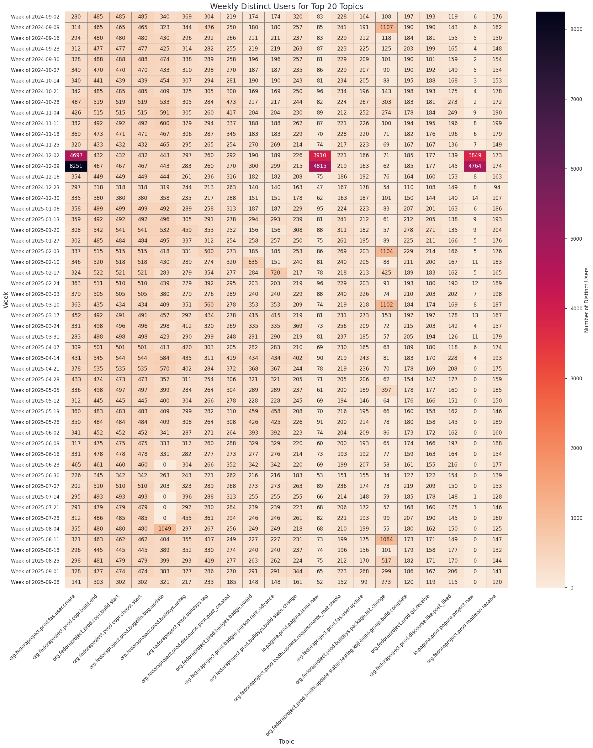
This analysis visualizes distinct user activity by topic across weeks.
Author
Robert Wright (rwright@)
Published
October 12, 2025
Weekly Distinct Users by Topic (Top 20)
This analysis visualizes distinct user activity by topic across weeks, using event timestamps from Fedora Messaging logs.
Show the code
import osimport globfrom pathlib import Pathfrom datetime import datetime, timedeltafrom collections import defaultdictimport numpy as npimport pandas as pdimport matplotlib.pyplot as pltimport seaborn as snsimport pyarrow as paimport pyarrow.dataset as dsimport pyarrow.parquet as pqplt.style.use("seaborn-v0_8")sns.set_theme(context="notebook", style="whitegrid")
Show the code
# @replace DATA_SOURCESDATA_SOURCES = {"datagrepper-parse-accounts": "/home/jovyan/work/bus2parquet/output_users"}parquet_dir = DATA_SOURCES["datagrepper-parse-accounts"]cutoff_date = (pd.Timestamp.now().replace(day=1) - pd.DateOffset(weeks=52)).date()files = []for p in Path(parquet_dir).glob("fedora-*.parquet"): stem = p.stem.replace("_processed", "") d = datetime.strptime(stem.split("-")[1], "%Y%m%d").date()if d >= cutoff_date: files.append(str(p))dataset = ds.dataset(files, format="parquet")chunks = []for batch in dataset.to_batches(batch_size=50_000): df = batch.to_pandas()if"sent_at"notin df.columns or"username"notin df.columns:continue df["sent_at"] = pd.to_datetime(df["sent_at"], errors="coerce").dt.floor("s") chunks.append(df)combined_df = pd.concat(chunks, ignore_index=True) if chunks else pd.DataFrame()ifnot combined_df.empty:print("Maximum date in data:", combined_df["sent_at"].max().date())print("Minimum date in data:", combined_df["sent_at"].min().date())else:print("No data found in cutoff range")
Maximum date in data: 2025-09-10
Minimum date in data: 2024-09-02
Show the code
# Drop rows with invalid timestampsinitial_count =len(combined_df)combined_df.dropna(subset=['sent_at'], inplace=True)cleaned_count =len(combined_df)# Assign week bucketscombined_df['week_start'] = combined_df['sent_at'].dt.to_period('W').dt.start_timecombined_df['week_label'] = combined_df['week_start'].dt.strftime('Week of %Y-%m-%d')
Show the code
# Count distinct users per week per topicaggregated_df = combined_df.groupby( ['week_start', 'week_label', 'topic'])['username'].nunique().reset_index(name='distinct_user_count')# Pivot for heatmapheatmap_df = aggregated_df.pivot( index='week_start', columns='topic', values='distinct_user_count').fillna(0).sort_index()heatmap_df.index = heatmap_df.index.strftime('Week of %Y-%m-%d')# Select top 20 topicstop_topics = aggregated_df.groupby('topic')['distinct_user_count'].sum().nlargest(20).indexheatmap_top = heatmap_df[top_topics]
Show the code
# Plot heatmapplt.figure(figsize=(20, 24))sns.heatmap( heatmap_top, annot=True, fmt=".0f", cmap='rocket_r', linewidths=0.5, linecolor='gray', cbar_kws={'label': 'Number of Distinct Users'})plt.title('Weekly Distinct Users for Top 20 Topics', fontsize=18)plt.xlabel('Topic', fontsize=14)plt.ylabel('Week', fontsize=14)plt.xticks(rotation=45, ha='right')plt.yticks(rotation=0)plt.tight_layout()plt.show()